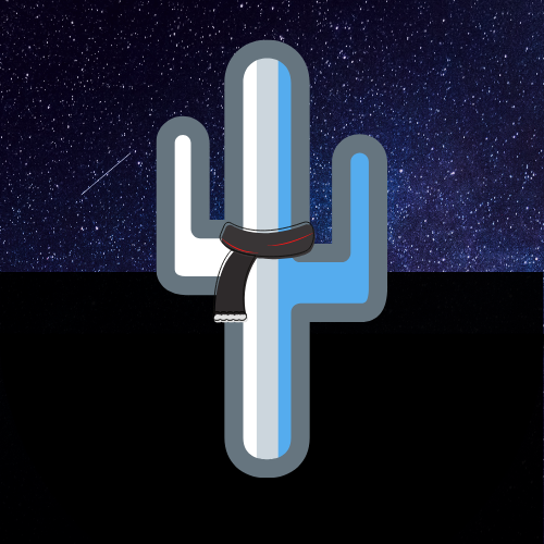
It’s been a busy day at Cold Arid Code. Over the last few weeks I have been mulling over the idea of a time-stamped checklist, a ‘done’ list if you will. This is another app that has its origins on the flight deck, the original concept being to track the cargo loading progress, but I realised that with a bit of generalisation it could be useful for many other tasks.
With the initial draft structure committed to paper and the name TimeTick chosen by the team, it was off to Canva to start putting together an icon design for the new application. Having settled on a design, the Cold Arid Code brand manager (a.k.a. the good lady Commercial Manager, her indoors) was consulted and it was promptly back to the drawing board to change the colours, to align with those used for my previous app, PilotCalc.
With the revised design finished, we realised that we now had two applications with consistent branding but the blue, black and grey colour scheme of the apps was completely at odds with the Cold Arid Code colours of light blue, yellow and shades of green. So, some time later, having redesigned the PilotCalc and TimeTick icons in shades of green and yellow and deciding that this new look didn’t work we turned our attention to a rework of the Cold Arid Code logo. We like the end result, a representation of a calm chilly night time desert, as opposed to the more lurid daytime scheme.

